群別データ分布図 Last modified: Oct 12, 2004
目的
群別のデータ点を記号で描く
使用法
dot.plot(x, y, accu=0, stp=0, log.flag=FALSE, simple=FALSE, symmetrical=TRUE, ...)
引数
x 群を表す変数の値ベクトル(factor でも,numeric でもよい)
y 分布を調べる対象変数の数値ベクトル
accu y を階級化するための値。
階級幅ということになるが,記号が重ならないようにするには,大き目の値を設定するとよい
stp 水平方向に記号を並べるときに,記号が重ならないようにずらすための値
log.flag 対数目盛りで描くときに TRUE を指定する(省略時には FALSE になっており,普通の目盛りで描く)
simple 対数目盛りで描くときに,目盛り数字を 10 のべき乗に限る(0.1, 1, 10, 100 などのみ)ならば TRUE にする
symmetrical 描画する記号を左右対称にせず,ヒストグラム風にするとき FALSE にする
... plot 関数が受け付ける任意の引数(使用例を参照)
注:accu と stp は対話的に決める方がよい。最初は指定せずに描き,出力された accu と stp の値を参考に調整する。
ソース
インストールは,以下の 1 行をコピーし,R コンソールにペーストする
source("http://aoki2.si.gunma-u.ac.jp/R/src/dot_plot.R", encoding="euc-jp")
# 群別のデータプロット
dot.plot <- function( x, # 群変数ベクトル
y, # データベクトル
accu=0, # データを階級化するための値
stp=0, # 水平方向に記号を並べるときのずらす量
log.flag=FALSE, # 縦軸を対数目盛りにするとき TRUE
simple=FALSE, # 対数目盛りのとき,目盛数値を 10 のべき乗に限るなら TRUE
symmetrical=TRUE, # 記号を左右対称にするなら TRUE
...) # plot 関数に引き渡すその他の引数
{
OK <- complete.cases(x, y) # 欠損値を持つケースを除く
x <- x[OK]
y <- y[OK]
x.name <- unique(x) # 群を表す変数の取る値(factor でありうる)
if (is.factor(x)) { # factor なら,
x <- as.integer(x) # 整数値に戻す
}
if (log.flag == TRUE) { # 対数目盛りで描くなら,
y0 <- y # 値のバックアップをとってから,
y <- log10(y) # 常用対数をとる
}
if (accu == 0) { # accu のデフォルト値を計算
accu <- diff(range(y))/100 # 最大値と最小値の差の百分の一
}
if(stp == 0) { # spt のデフォルト値を計算
stp <- diff(range(x))/100 # 最大値と最小値の差の百分の一
}
y <- round(y/accu)*accu # y を丸める
x1 <- unique(x) # 群を表す変数の種類(数値に変換したもの)
for (i in seq(along=x1)) { # 全ての群について,
freq <- table(y[x==x1[i]]) # ある群のデータについて度数分布を求める
for (j in seq(along=freq)) { # 度数分布の各階級について
if (freq[j] >= 2) { # 複数個のデータがあるならば,
offset <- ifelse(symmetrical, (freq[j]-1)/2*stp, 0) # 対称に描くかどうかで描き始めが違う
for (k in seq(along=y)) {
if (abs(y[k]-as.numeric(names(freq)[j])) < 1e-10 && abs(x[k]-x1[i]) < 1e-10) {
freq[j] <- freq[j]-1
x[k] <- x[k]-offset+freq[j]*stp
}
}
}
}
}
if (log.flag) { # 対数目盛りで描くなら,
plot(x, y, type="n", xaxt="n", yaxt="n", ...)
options(warn=-1)
points(x, y, ...)
options(warn=0)
y0 <- floor(log10(y0))
log.min <- min(y0)
y2 <- 1:10*10^log.min
n <- max(y0)-log.min
y1 <- rep(y2, n+1)*10^rep(0:n, each=10)
if (simple) {
y2 <- y1[abs(log10(y1)-round(log10(y1))) < 1e-6]
axis(2, at=log10(y1), labels=FALSE)
axis(2, at=log10(y2), labels=y2)
}
else {
axis(2, at=log10(y1), labels=y1)
}
}
else {
plot(x, y, xaxt="n", ...)
}
axis(1, at=x1, labels=as.character(x.name))
print(paste("accu =", accu, " stp = ", stp), quote=FALSE)
}
使用例
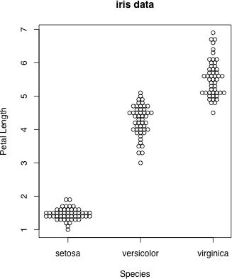
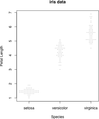
data(iris) # Fisher の iris data を,種別に図示してみる
dot.plot(iris$Species, iris$Petal.Length, accu=0.1, stp=0.05, xlab="Species", ylab="Petal Length", main="iris data")
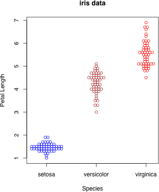
 col により色を変える
g <- as.integer(iris$Species)
dot.plot(iris$Species, iris$Petal.Length, accu=0.1, stp=0.05, xlab="Species", ylab="Petal Length", main="iris data", col=c("blue", "brown", "red")[g])
col により色を変える
g <- as.integer(iris$Species)
dot.plot(iris$Species, iris$Petal.Length, accu=0.1, stp=0.05, xlab="Species", ylab="Petal Length", main="iris data", col=c("blue", "brown", "red")[g])
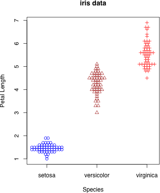
 pch により,記号を変える
dot.plot(iris$Species, iris$Petal.Length, accu=0.1, stp=0.05, xlab="Species", ylab="Petal Length", main="iris data", col=c("blue", "brown", "red")[g], pch=g)
pch により,記号を変える
dot.plot(iris$Species, iris$Petal.Length, accu=0.1, stp=0.05, xlab="Species", ylab="Petal Length", main="iris data", col=c("blue", "brown", "red")[g], pch=g)
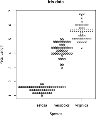
 pch により,アルファベットなどで描くこともできる
dot.plot(iris$Species, iris$Petal.Length, accu=0.2, stp=0.1, xlab="Species", ylab="Petal Length", main="iris data", pch=letters[g])
pch により,アルファベットなどで描くこともできる
dot.plot(iris$Species, iris$Petal.Length, accu=0.2, stp=0.1, xlab="Species", ylab="Petal Length", main="iris data", pch=letters[g])
 pch = "." とすると,目立たないがデータがたくさんあるときにはいいかもしれない
dot.plot(iris$Species, iris$Petal.Length, accu=0.1, stp=0.05, xlab="Species", ylab="Petal Length", main="iris data", pch=".")
pch = "." とすると,目立たないがデータがたくさんあるときにはいいかもしれない
dot.plot(iris$Species, iris$Petal.Length, accu=0.1, stp=0.05, xlab="Species", ylab="Petal Length", main="iris data", pch=".")
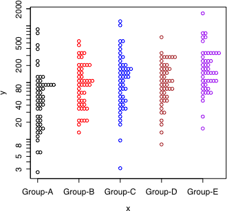
 log.flag = TRUE により,対数目盛りのグラフにすることもできる
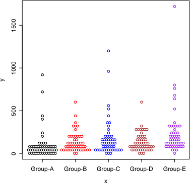
set.seed(111)
x <- factor(rep(paste("Group", LETTERS[1:5], sep="-"), each=50))
y <- rnorm(250)+rep(1:5/5, each=50)
y <- exp((y-min(y)+1))
dot.plot(x, y, accu=40, stp=0.065, col=c("black", "red", "blue", "brown", "purple")[as.integer(x)])
dot.plot(x, y, log.flag=TRUE, accu=0.07, stp=0.065, col=c("black", "red", "blue", "brown", "purple")[as.integer(x)])
左は通常目盛りで描き,右は同じデータを対数目盛りで描いた。
それぞれの群において,データは対数正規分布に従うように作られた。
log.flag = TRUE により,対数目盛りのグラフにすることもできる
set.seed(111)
x <- factor(rep(paste("Group", LETTERS[1:5], sep="-"), each=50))
y <- rnorm(250)+rep(1:5/5, each=50)
y <- exp((y-min(y)+1))
dot.plot(x, y, accu=40, stp=0.065, col=c("black", "red", "blue", "brown", "purple")[as.integer(x)])
dot.plot(x, y, log.flag=TRUE, accu=0.07, stp=0.065, col=c("black", "red", "blue", "brown", "purple")[as.integer(x)])
左は通常目盛りで描き,右は同じデータを対数目盛りで描いた。
それぞれの群において,データは対数正規分布に従うように作られた。
 |
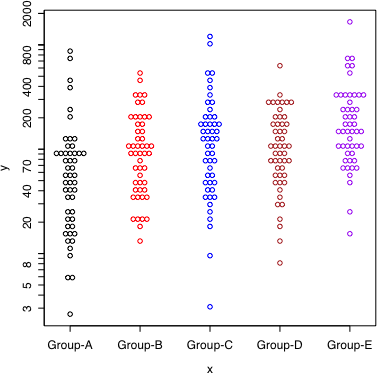 |
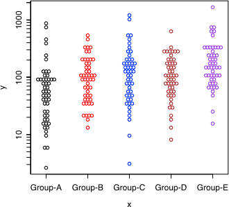
simple = TRUE により,対数目盛りのラベルを簡略化する
 symmetrical = FALSE により,ヒストグラム風になる(左右対称にしない)
 直前のページへ戻る E-mail to Shigenobu AOKI
